Creative Critical Reflection
Question 1- How do your products represent social groups or issues?
Ans: The focus of our project is the mental health issues and drug addiction faced by teenagers these days. The main character is grieving the death of her best friend who she lost to drugs. Often in the media, the story of addicts revolves solely around them but in our project, we tried to circulate more around the loved ones of the addicts, who are often side-lined and the repercussions of losing someone to drugs on their mental health are not often discussed. Considering Judith Butler’s theory, our project stereotyped the girl to be more emotional and expressive while the man wasn’t portrayed as emotional, he was mostly angry since that’s how typically men are stereotyped to behave in situations.
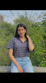
Question 2- How do the elements of your production work together, to create a sense of branding?
Ans: Our music video mainly has low-key lighting to create a gloomy ambiance that goes with our narrative. We used multiple lights such as blue, red, purple, and multiple changing lights in a few shots to connote the emotions of the characters. We used similar color templates and lightning for the pictures we took for the digipak and social media page, and since we were portraying teenagers, they were mostly in casual attire similar to what teenagers normally wear. We did so to create a sense of reliability with our target audience. The clothes of the actors are the same throughout our production package. We photographed our main character in front of the cupcake with the candle on it, using low-key blue light for the front cover of our digipak and social media page. The same cupcake and candle were used in the shots we took for our music video to depict the loneliness of our character even on her own birthday. When she blows on the candle in the end, she finally accepts that she has lost a best friend and has been through all 5 stages of grief. We were mostly inspired by the HBO series, Euphoria. The narrative of our music video, which is centered around depression and drug abuse, is similar to that of euphoria and the use of multiple color lights in euphoria inspired us to do the same for our production package.
Question 3- How does your product engage with the audience?
Ans: The target audience of our project is teenagers since we tried to shed light upon the prevalent mental health issues and depression faced by teenagers these days. We also narrated the story of an addict and how it's affecting his relationship, thus, we targeted the younger audience who are more exposed to drugs these days and are more likely to use them. Our product focuses more on gathering a western audience since drugs have become more commonly used there while in the east there are still relatively more restrictions on drugs and can’t be easily accessed, thus, according to Stuart Hall's theory it would be easier for the western audience to decode our project, making a proper sense out of it. Our product targets all genders since the issue we highlighted can be faced by anyone regardless of their gender and identity.
Question 4- How did your research inform your products and the way they use or challenge convention?
Ans: In the initial stages of our planning stage, we watched a couple of music videos to get inspiration. Our narrative was inspired by the HBO show euphoria and the fan-made video of ‘Always Forever’ by Cults, in which the character is also mourning someone’s death while euphoria was a great inspiration for shedding light on the issue of the abuse of drugs and depression. Our lighting plan was also inspired by euphoria, in which they also normally use multiple lights to narrate the stories of the characters. Our lightning was also inspired by the music video of ‘it ain’t me’ by Selena Gomez, in which they used a lot of blue and red lighting.
Our narrative was also inspired by the original music video of ‘ Xanny’. Following the critique of Andrew Goodwin, the narrative of our project was centered around the lyrics and we tried to make every shot follow the story the lyrics were telling us, which was quite different from the original music video which wasn’t completely following each other lyrics. In the original music video, they are using cigarettes and smoke to connote the use of drugs which inspired us to do the same for our music video. However, visually our music video is quite different from the original since we used low-key and unnatural lights while high-key lighting was used in the original video. Moreover, while we changed locations, lightning, and the story of each shot to create a fragmented narrative, the original video was linear throughout, and the entire video is shot in the same location under the same lights.
Conventionally music videos use single lightning to create an ambiance, however, the role of the lights in our project is more than just to lit up the room but to connote the emotions of the characters. We brought meaning to the lights by using blue to represent sadness and loneliness, red for anger, and lilac for a mixture of feelings. Music videos are mostly fragmented and the producers try to make them more visually attractive rather than telling a story thus, the same is the case with our music video although we did try to shed light on a story. Satisfying the prerequisite of the music video laid out by Andrew Goodwin, we followed each beat and changed the shots along with it. Mostly in media products, producers tend to focus on the issues faced by addicts, ignoring the struggles of the people close to the addicts. We in our project tried to focus on the mental struggles of the loved one of the addict who was slowly drifting away from her best friend. According to Goodwin, voyeurism in music videos attracts more audience while we create an unconventional product we neither use voyeurism nor objectified any character.

Comments
Post a Comment